Hey Friends!!
Did you have a great weekend?! I sure hope so!
I told you last week that we finished the hallway bathroom! I’ve been trying to put the finishing touches on the room & part of that included making a new sign for the main wall across from the shower.
I told you when I started the bathroom makeover, that I was gonna stick with the beachy theme we already had going on in there. So, in keeping with that theme, I decided to make a “beach” sign to match the decor. Ever since I laid eyes on Karianne’s bathroom, I’d been dreaming about it! 🙂
This is what I came up with….
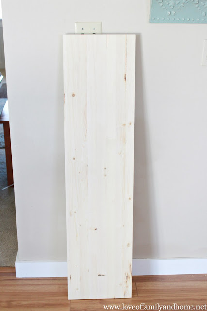
I started off with this 4 foot whitewood board that I bought at Lowes for $3.97.
I primed it…..
And then painted it….
For those of you who are wondering, the aqua color I used is called “Sparkling Lake.” It is a valspar color from Lowes. It was leftover from this project.
Then, I bought these letters to spell out the word “Beach” at Hobby Lobby. They were $2.49 a piece.
At first, I just thought about painting the letters & attaching them to the board, but then I decided to just use the letters as a stencil and then handpaint the sign. So, I drew a line at the bottom of the board to ensure that I had the letters straight…..
And then I just spaced them out evenly across the board….
Once I had the spacing the way I wanted it, I then used a pencil & began tracing the letters onto the board.
Using a small craft paintbrush, I started filling the letters in with paint.
You don’t have to be perfect when painting the letters on the board. If you get outside the lines a little bit…..no worries!! When you are finished painting the letters, let them dry well and then take some sandpaper & sand down the top of the board to give it that “weathered” look! The sanding will also hide any imperfections in the handpainted letters.
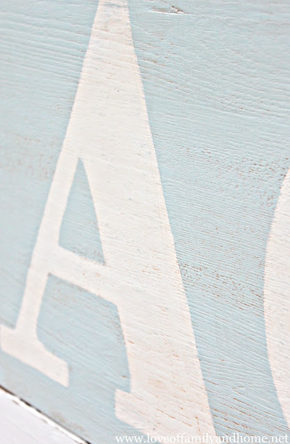
When I was finished sanding, I used an antiquing medium (the same stuff I used HERE) to make the board look aged, worn, & weathered. You can see a little bit more detail in this photo….
I had the sign outside when I was sanding it down, so it just kinda stayed outside for pictures! 🙂 It’s resting on our fence surrounding our backyard in the photo above.
Then, I had to bring it inside to see what it was going to look like in our new bathroom! 🙂
It’s just sitting on top of our new chair rail in this photo, but I plan on hanging it tomorrow! Just another sneak peek for you guys!! 🙂
What do you think?!
I think it turned out pretty cute!
This was pretty much the last thing I was wanting to accomplish in this space, so you expect the full reveal in the next few days!
Thanks so much for stopping by!! Talk to you again soon!
Have a Terrific Tuesday!!
Linking up here….
Friday Faves at Walking in Grace & Beauty.
Weekend Wrap-Up Party at Tatertots & Jello
Don’t Miss Out – DIY projects, home decorating, crafts & more by checking out my subscribe page






















Can’t wait to see the finished room – looks so great so far!
I used this same technique with some chipboard letters – makes for a great stencil!
Love this! I totally want to do a sign for my laundry room now!!
Love it! Working on my first hand painted sign now. 🙂
It turned out great!!!! I can’t wait to see it in person!
Love,
mom
That looks fantastic, I love the light colors you used.
You can do signs like this for your living room as well quoting your name or family name. I think it was looking great even in its fresh new look.
WOW! That looks amazing!
Tonya that sign looks so good! I love everything you do, very talented!!
Blessings,
Cyndi
I just made the Beach sign like yours for our guest bathroom. I used a darker almost teal color for the background and white for the letters. When I got to the antiquing part it went bad. It seemed the medium was too dark even though I followed the instruction on the bottle to the T. Now it has brown horizontal marks on the background and the white letters have browns where there’s grooves on the paint. I can still put it up but it just doesn’t look as good as yours. I tried to wipe off excess medium with a wet rag as much as I could.
So I made this sign for our guest bathroom except I used a darker blue color, teal, as the background. After it was all painted it looked really nice. Then I sandpapered it and applied the antiquing medium and now it doesn’t look as good as hoped. The white letters now have brown spots where there’s grooves on the wood, the background looks dirty. I tried to wipe off excess medium with a wet cloth as much I could but it is what it is. What did I do wrong? I’ll still hang it up because I don’t want to waste all that material and effort for nothing.