Hey Friends!
I hope you all had a wonderful weekend!! Since the beginning of this year, I have been wanting to make some changes to our master bedroom….

It just occurred to me while planning this post, that I’ve never show you pictures of our master bedroom! That’s probably because I am not really satisfied with this room!! We’ve had this bedroom set for 7 years now. It was a wedding present from my grandmother. I love our bed, but starting to grow tired of our dresser, nightstand, & armoire (not shown here.) Looking back now, I wish we wouldn’t have purchased a bedroom “set” and instead picked our pieces out separately, BUT you live & you learn, right?! My friend Carmel, at Our Fifth House talked about this recently in THIS POST & shared pictures of how just switching out the hardware on her furniture made a huge difference! Thinking that may be an option for me as well. The current knobs on the furniture definitely aren’t doing it for me!
Things I don’t like about this room…..
1. The fact that the furniture is so “matchy-matchy.”
2. Is it just me or is everything the SAME COLOR?!
3. I have never figured out any type of display or vignette for my dresser.
4. The furniture was somewhat recently moved so that the bed would be in front of the window…now the vinyl on the wall is not in the right spot, but I’ve yet to take it down! 🙂
5. I don’t feel like the room reflects my personal taste & style anymore.
One of the sessions I attended at Haven was “Design Studio” & a portion of it was taught by the fabulous Darlene, from Fieldstone Hill Design. She talked about defining your personal style & choosing pictures out of magazines, from Pinterest, & DEFINING the things you like about them and also analyzing their commonalities. I had started a master bedroom inspiration board on Pinterest long before I attended her class, but after listening to her talk, I think it’s easy to determine my personal style!! Most of my pins scream “cottage” style.
Today, I thought I would share some of my favorite bedroom “pins” with all of you & kinda share my vision for our master bedroom makeover. I hope you enjoy these 10 Cottage Style Bedrooms!
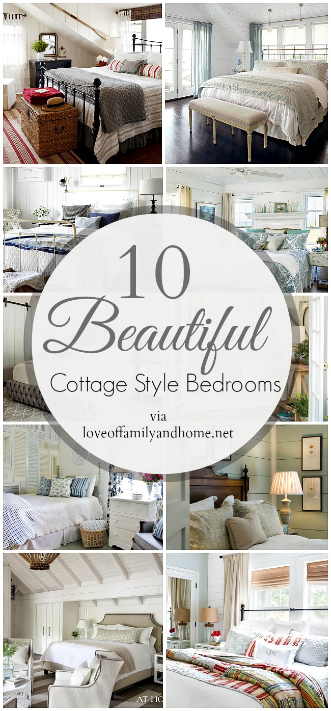

.jpg)
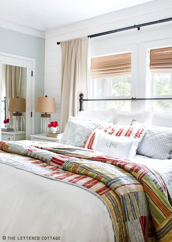
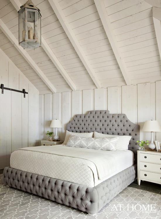


Do you see the commonalities?!
1. All the rooms have some type of wall treatment….plank walls, beadboard, board & batten, etc.
2. A lot of the rooms have the same type of treatment on the ceiling as well.
3. They all have a very “light & airy” type feel to them with most of them using a white wall color.
4. Most of the rooms have chosen a very neutral bedding, with just one or two accent colors.
Are there any others that you can identify?!
Looking at YOUR pins, can you DEFINE your personal style?!
Wanna follow me on Pinterest?!
You can do so by clicking HERE.









I struggle with the same challenges you do. My bedroom furniture was a set that I ended up painting creamy white. Something always bothered me until I spray painted the hardware and just that little change made all the difference. I also did a board and batten cottage treatment to the back wall and I can now say I am officially pleased with the room. Still a lot to accessorizing to do. But now it’s the really fun stuff to add little bits of color here and there.
http://pinetreehome.blogspot.com/2012/05/master-bedroom-board-and-batten.html
They have a ton of cute knobs at Hobby Lobby. I really like the room, but completely get ya. Maybe a nice new wall color and bedding with may a change. I also love to rearrange furniture for a change.
I love your inspiration photos! My master bedroom is next on my decorating list! It’s funny how this room usually ends up being the last one done! Can’t wait to see how your ideas all come together.
I think your master bedroom looks great! Seriously! I do love the room with the light blue wall and the lined up picture frames above the bed…ahhhh…so gorgeous! Stop with all of the inspiration or I’m gonna have to call my dad over to re-do my bedroom!
Thanks for the shout out girlie! I attended that same session and really loved what they all had to say. I’m working on my “do’t buy” word right now. 😉 Your inspiration pics are dreamy – can’t wait to see how you bring them to life!
Great article! Here are some tips for a master bedroom makeover:
Walls: You aren’t stuck with the bland, beige walls the house might have come with. Have fun by thinking beyond the traditional four-matching-walls aesthetic.
Furniture: By simply moving your furniture around, you can breathe new life into a familiar space.
For more see our blog: http://bit.ly/NhfJk7
@BlueFernRE
want to trie to see if the pill work, want to last long
Feel free to visit my blog post :: superman stamina free video
thanks for that bit of info Richard! mercury in our bodies
is not our friend!
Look into my homepage; teeth whitening reviews consumer reports uk
What nationality is the most appealing men/women and what nationality has the ugliest
men/women ?
Here is my blog – Things don’t
Does one nevertheless advocate this item? Its Nearly drop and time for you to put my shirt back again on.
Also, time for you to experiment.
My website :: six pack shortcuts download pdf
sublime design,
if that was my space Id totally grow some.
.. “tomato plants”… at the end on the bed as
well.
my web-site: cheap arrow sheds
Ok. Now i can pick female. great but now i won’t calculate following I enter all the quantities
Here is my webpage best weight loss Supplements for men gnc
hulk would win, it could be a special battle maybe inside the beginning but superman features a difficult time defeating
DOOMSDAY but since the fight will progress THE HULK SMASH LITTTLLLEEE MMMMAAANNNN!
!!
Stop by my weblog Premature ejaculation treatment natural remedy
How lengthy can you keep these in the freezer before you prepare dinner them?
My site healthy cooking blog
I have the same issue with matchy – match bedroom furniture. It was what you did back then but the trend now is the mix it up. I got rid of the bed to my furniture suite and replaced it with an iron bed. Made a huge difference. I will say I noticed in a lot of your photos the beds have been placed in front of windows. To me, it makes the arrangement look as though there wasn’t enough space in the room to accommodate the bed and it blocks the window. I prefer to see out the View and obscures the light. I think it is better to work with the architecture of the room and scale down the use of furniture.